Team Project
UI/UX & Technical Designer
Engine: Unreal Engine 5
Duration: 7 Weeks
Status: Released on Steam
Available on Steam
Fear of the Light is a sci-fi survival horror game where the light is scarier than the dark. Created for the course Game Project 3 at Futuregames.

UI/UX Design Responsibilities Included:
Design and implement the game's UI
Diegetic UI for player tools and data terminal
The overall user experience
Awards:
BEST DESIGN Nominee at SGA 2024
BEST TECH winner at the FGA 2024
.png)
.png)
.png)
.png)
.png)
.png)
.png)
.png)
.png)
.png)
.png)
UI/UX DESIGN & IMPLEMENTATION
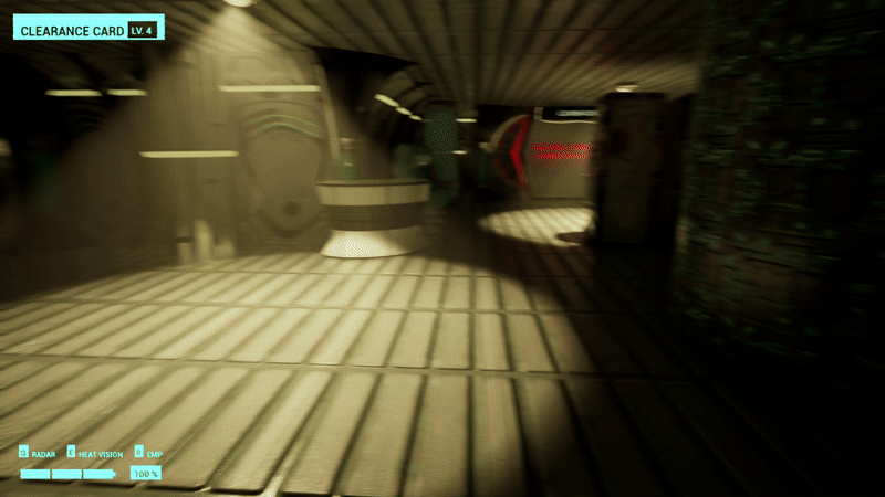
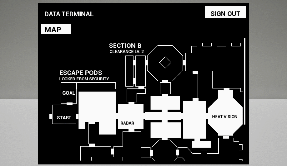
DATA TERMINAL
The data terminal serves multiple purposes:
to convey lore with information about the current situation
a map of the area
progression by unlocking the next area and autosaving the game
TECHNICAL IMPLEMENTATION
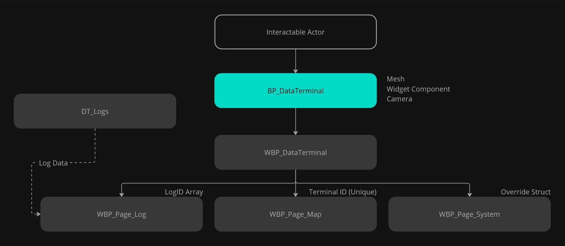
BP_DataTerminal
The main actor blueprint.
Handles the transition between gameplay & UI.
Holds data for the widgets.
WBP_DataTerminal
The main widget blueprint.
Holds the layout for the UI.
Manages the different content pages.
PAGE DATA
Logs: Takes in a string array of LogID's. The log content is stored in a data table, one row represents one log. The LogID matches the data table row name.
Map: Takes a bool and a SaveID. Every BP_DataTerminal has a unique ID, I use it to display the current position on the map.
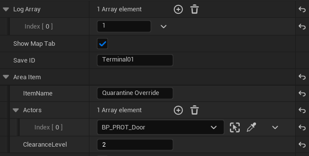
Systems: Takes in an AreaItem struct with text to display on the UI, references to doors in the level and needed clearance level.
LOG PAGE
The log page consists of two containers. First one holds a sidebar listing all the available logs. The second holds the log content, with a header and the bread text. I experimented with formatting the bread text by using Rich Text Styles so the writer can emphasize certain words.
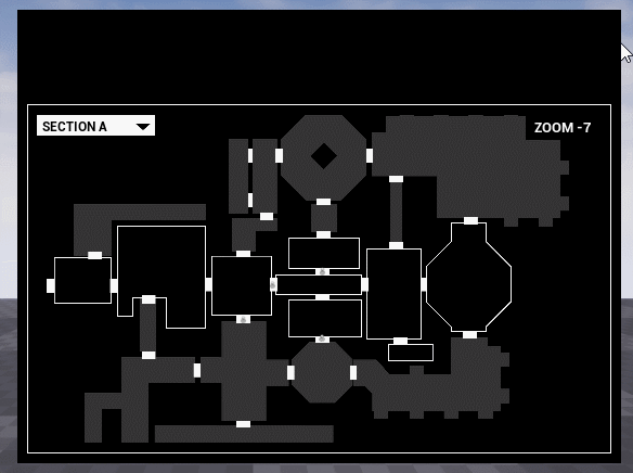
MAP PAGE
The map needed to convey a lot of information in a limited space. The entire level would undoubtedly not fit whilst still being readable so zoom in/out and panning functionality would be suitable.
FIRST VERSION
For the first playtests I nested two scroll boxes inside each other, one vertical and one horizontal. It works, but is very awkward to control.
FINAL VERSION
After researching I saw a smarter solution using 2 canvases. The outer canvas functions as a mask and is the required window size.
The inner canvas is the size of the full map. The position and size of the inner canvas can then be panned and zoomed based on user input and mouse position.
The map itself is an image made using a top-down screenshot of the game level as a guide and drawing the outlines over it.
The area names and special icons are added over this image in the engine, so they are easy to edit.
Original source with full explanation and code
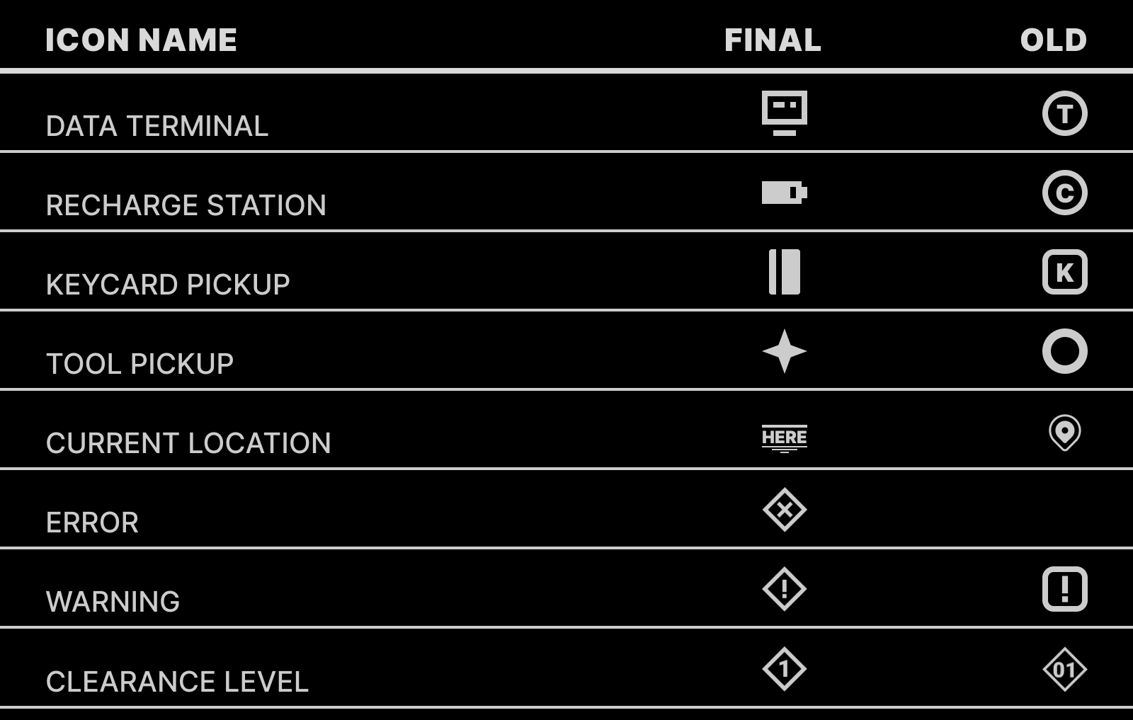
ICONS
The old icons had clarity issues, particularly for the radar because of the small size combined with the emissive color making them unreadable.
The letters confused players on what they referred to. I tried using different letters based on play testers feedback, but the problem still persisted.
I decided to skip the letters and instead imitate the object's appearance in game.
This gives the icons a unique silhouette, making them distinct from each other.
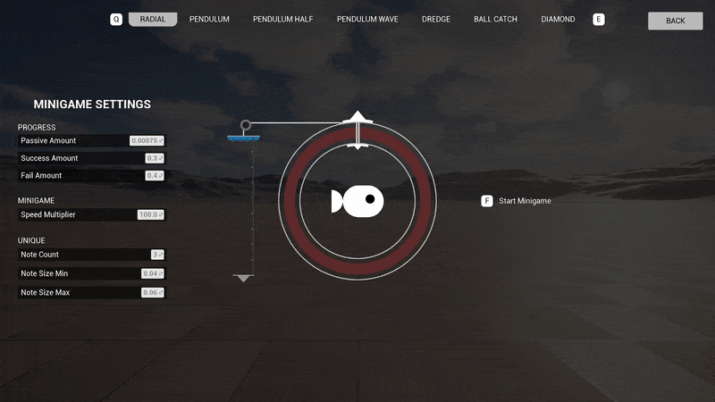
TOOLS
Navigating in the dark is difficult, especially when you're being hunted down by alien moths. To help the player out a bit they have 3 tools, 2 of which have UI.
RADAR
The radar detects objects of interests, and objects to avoid. It drains battery whilst being used.
During early playtests I noticed the current battery level was often missed.
I added the battery to the radar's tool screen.
EMP
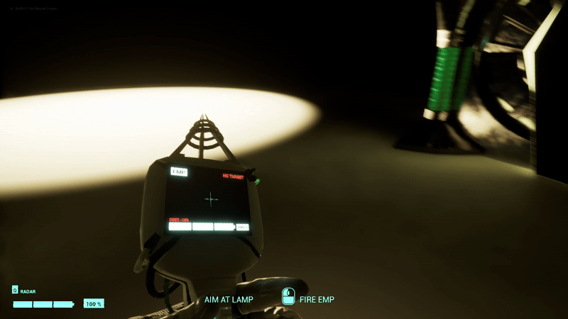
FIRST VERSION
The EMP can turn off lights for a duration at the cost of battery charge.
The EMP has the same screen layout as the radar because they're both on the same mesh.
FINAL VERSION
I added a crosshair to the HUD to improve aiming. This let me give more feedback to the player on when they can or can’t shoot.
I use color and opacity to inform the tool's current status.