
Team Project
UI/UX & Technical Designer
Engine: Unreal Engine 5
Duration: 6 Weeks
Status: Released on Itch.io
Available on Itch.io
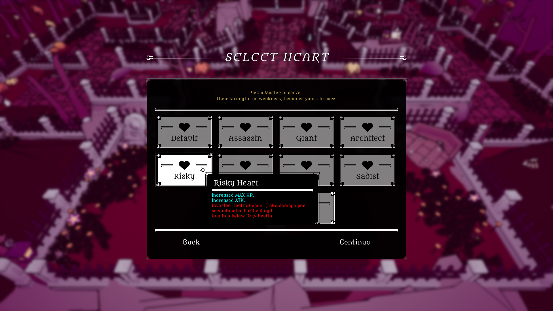
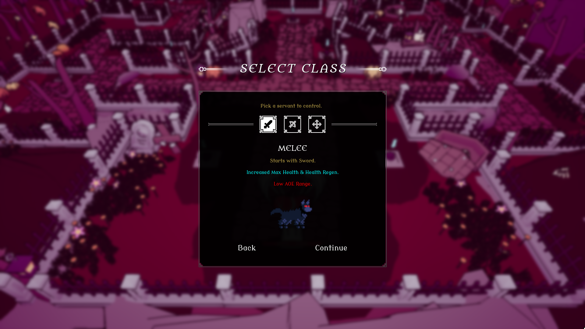
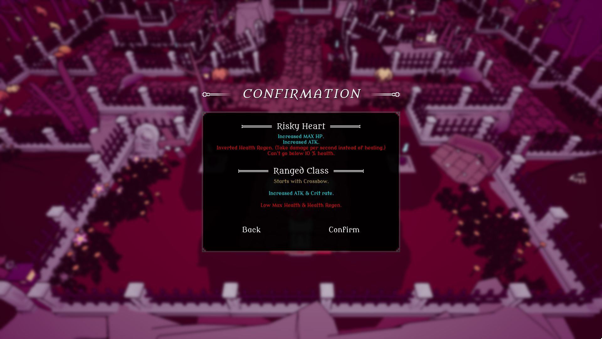
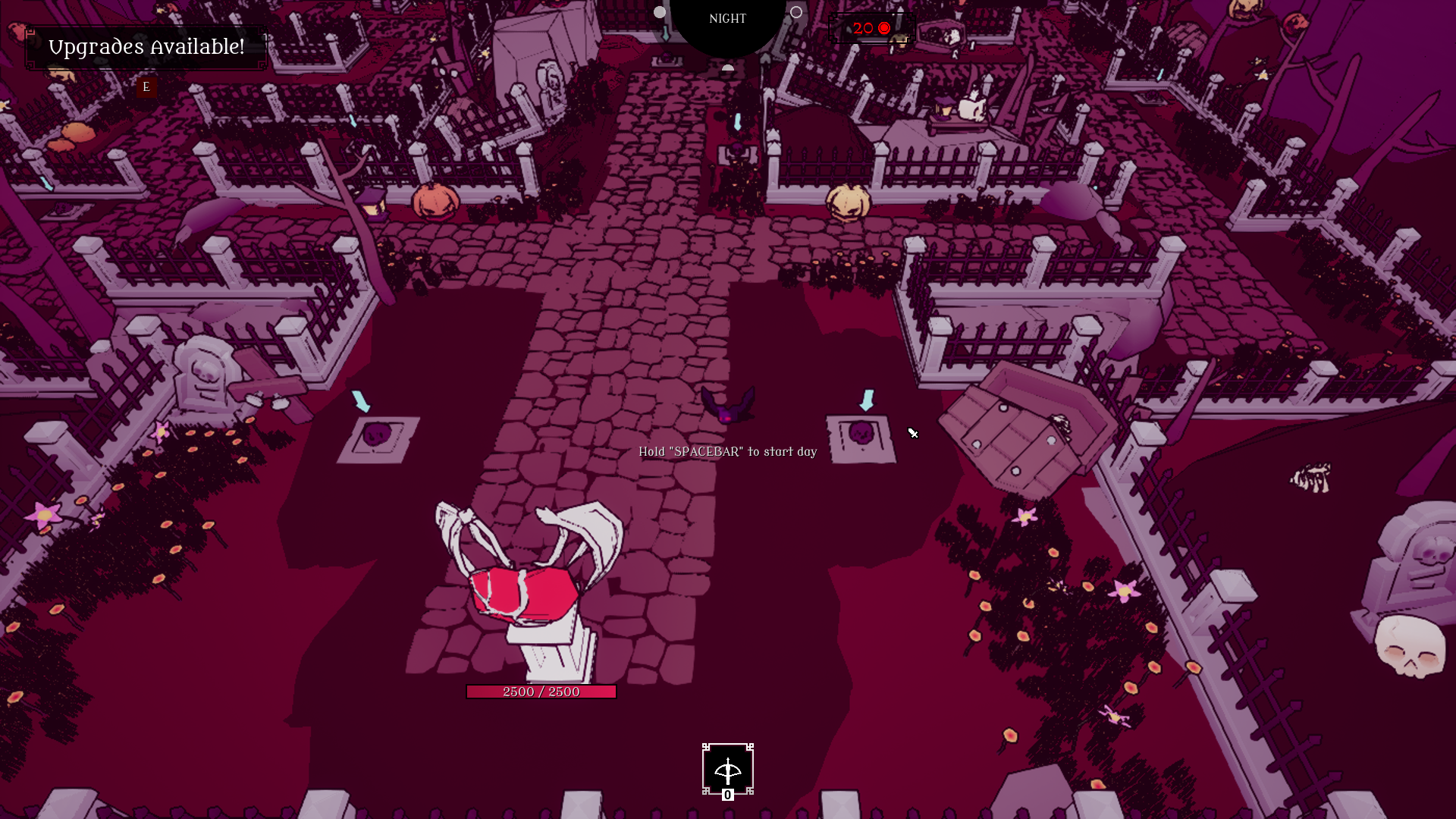
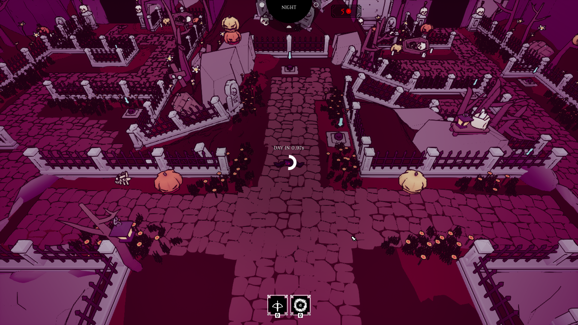
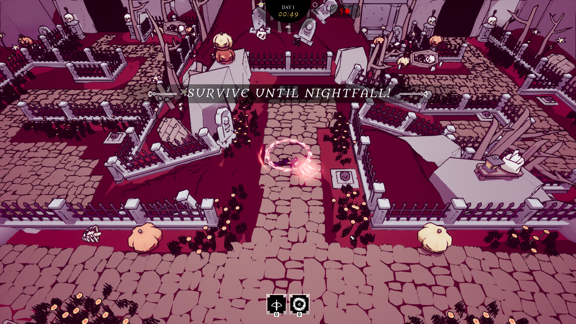
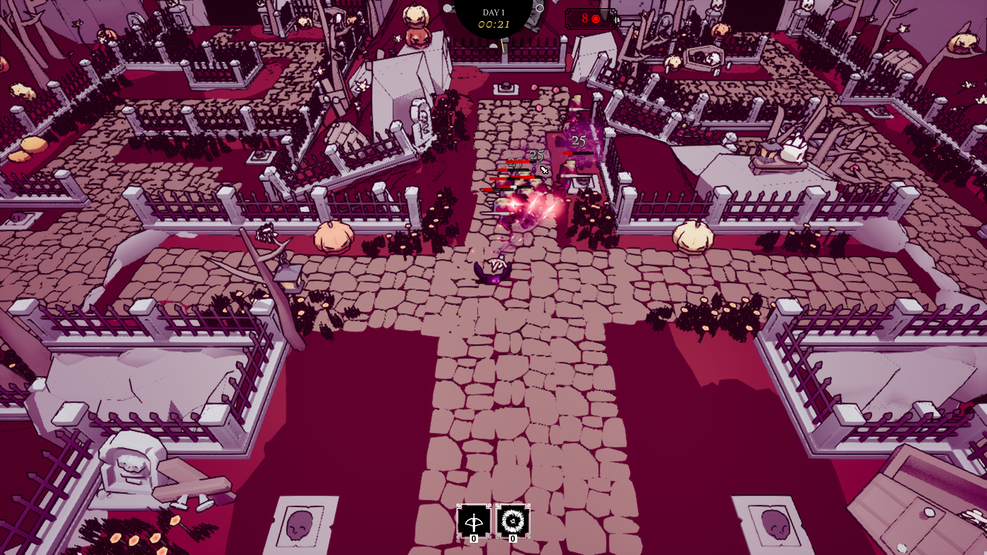
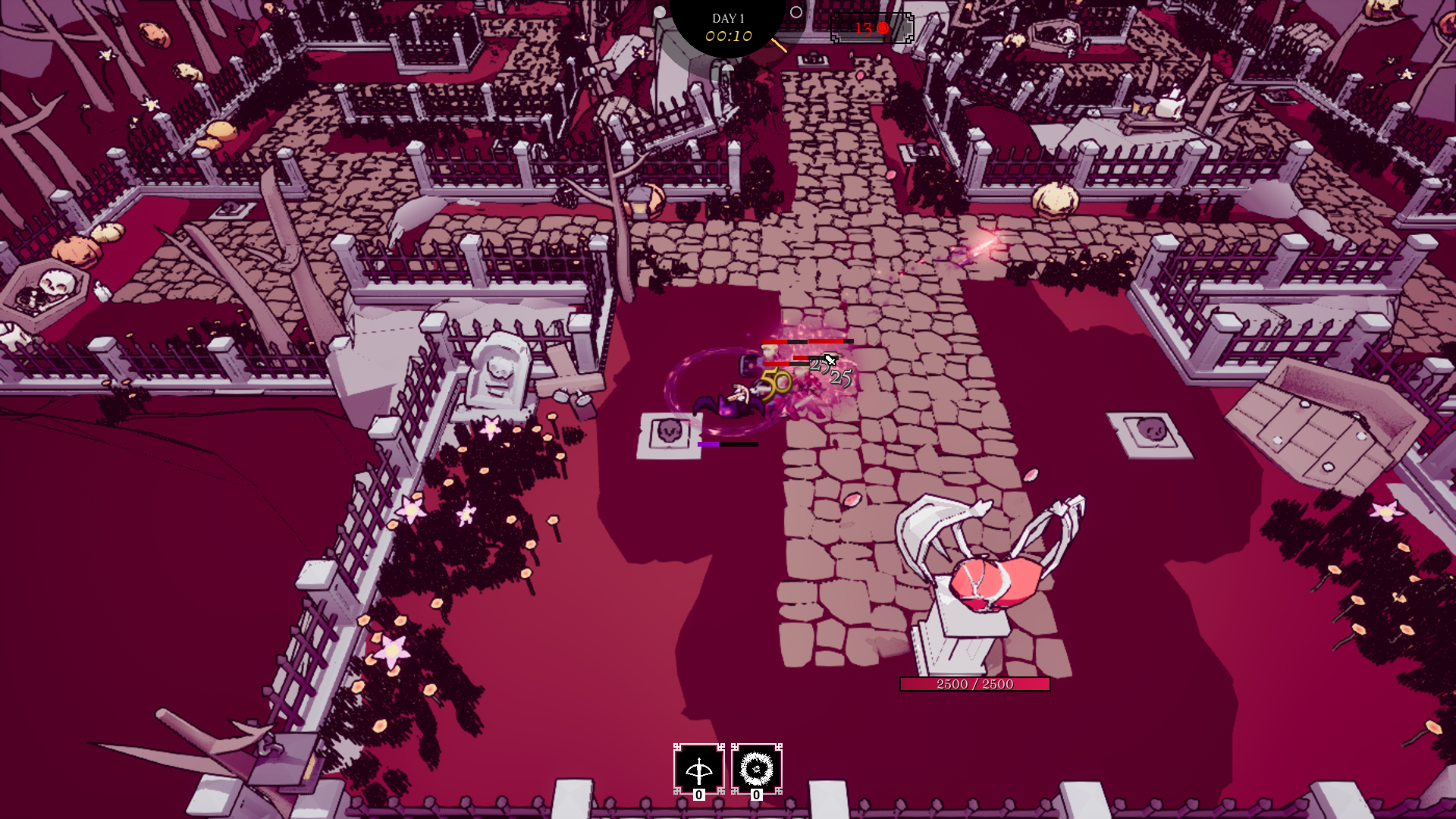
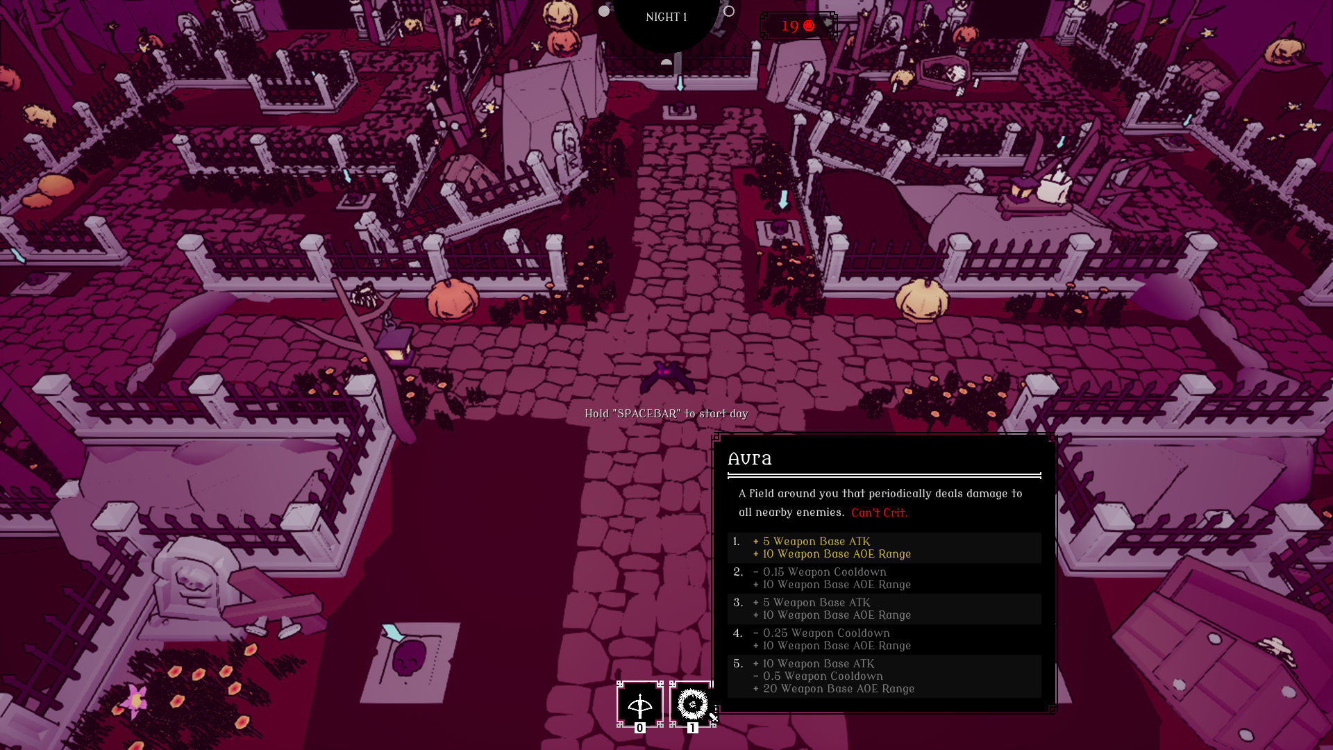
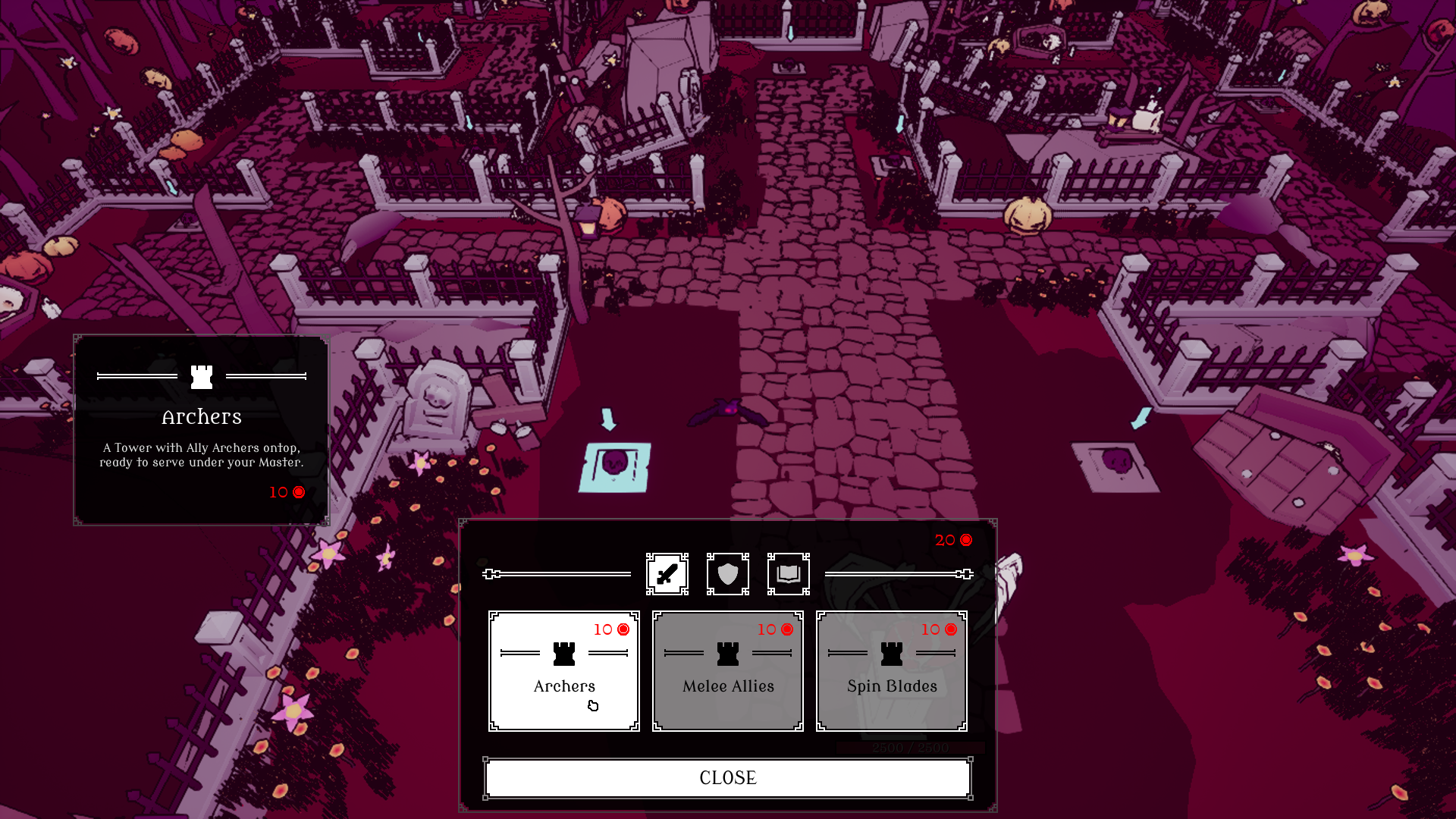
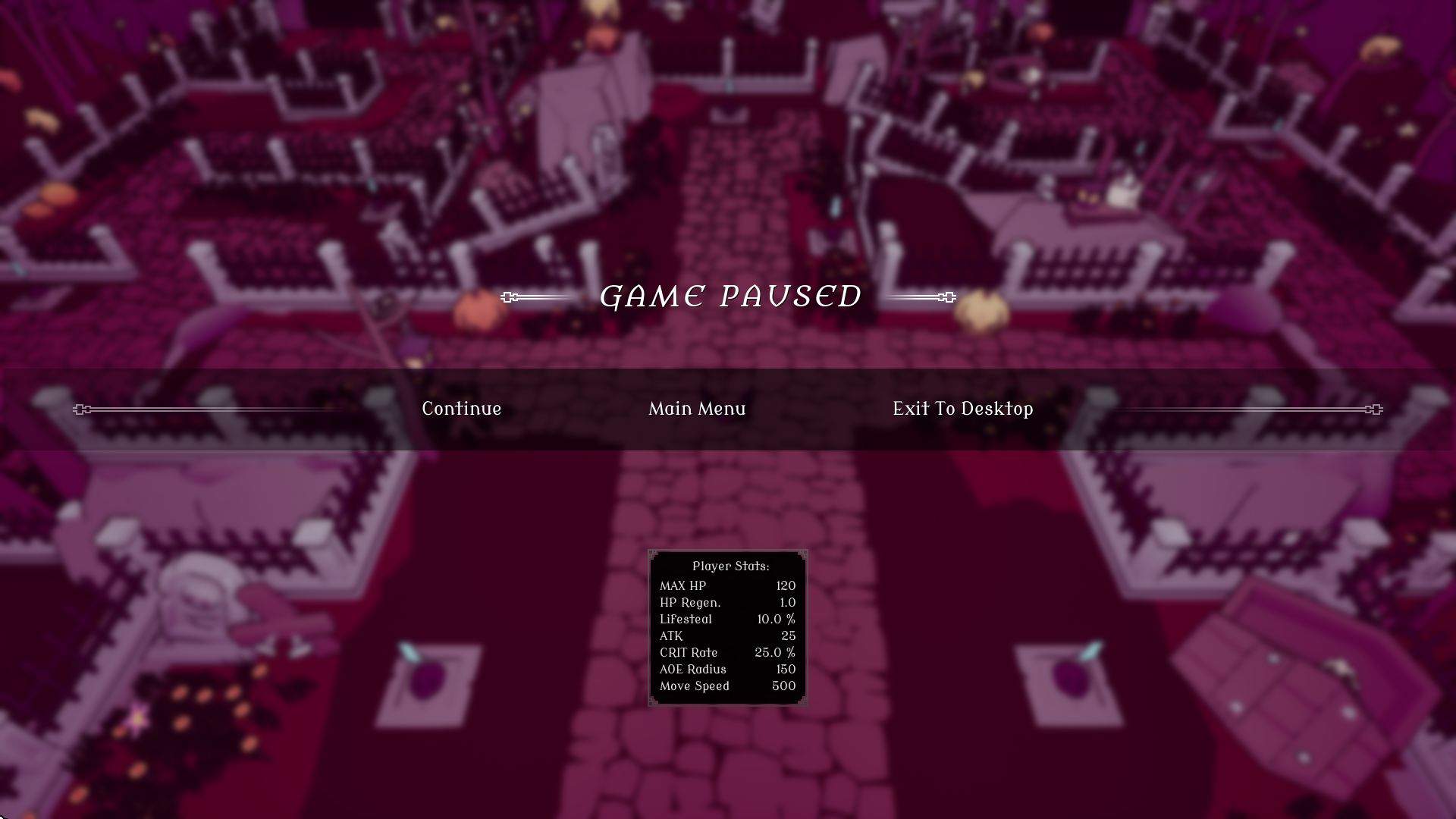
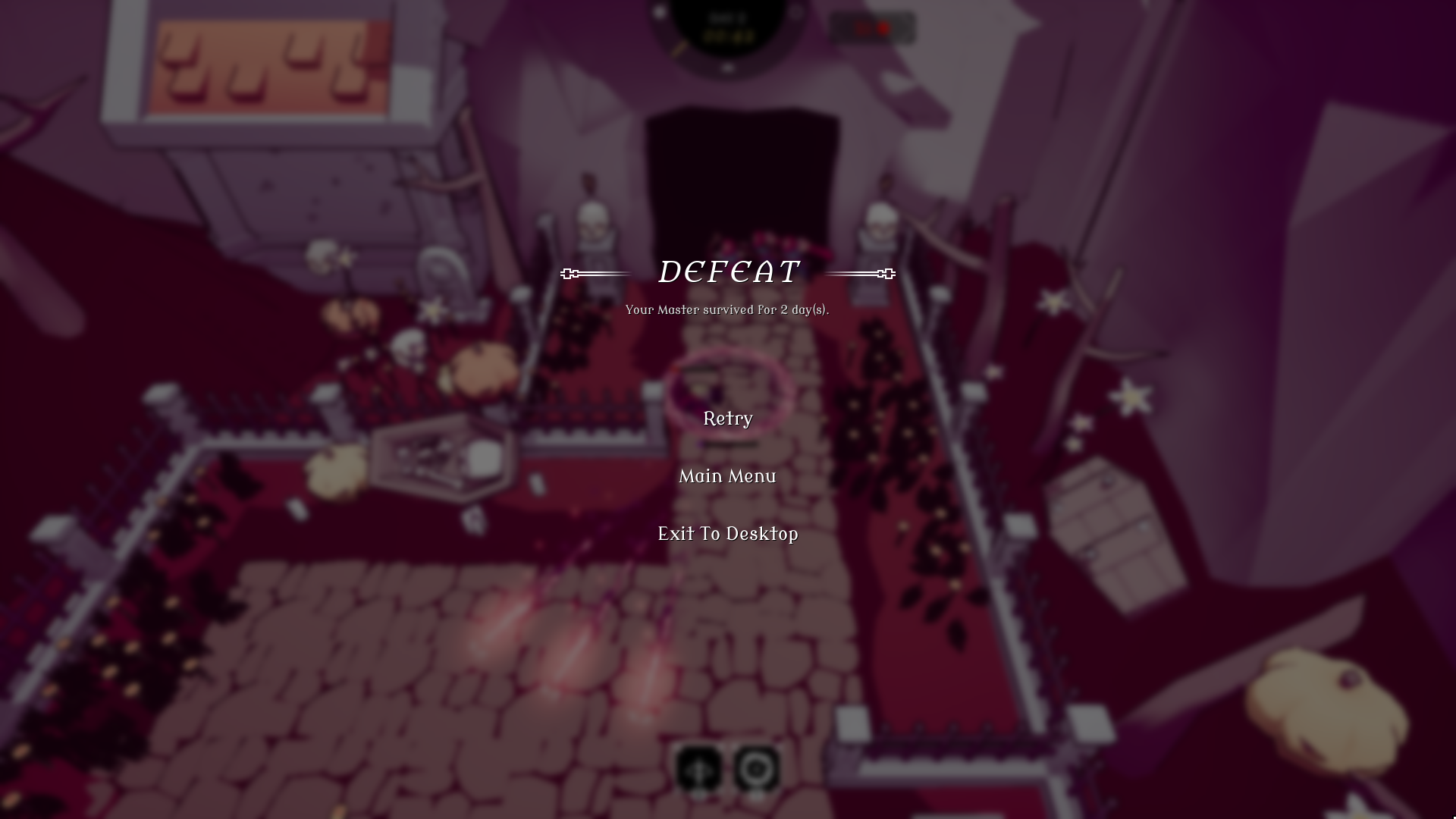
Vampower is a survival-like tower defence game with minor roguelike elements were you must protect your Vampire overlord from hordes of enemies. Tailor your playstyle by selecting 1 out of 10 hearts to serve and choose between 3 classes, with different stats and starting weapon.
UI/UX Design Responsibilities Included:
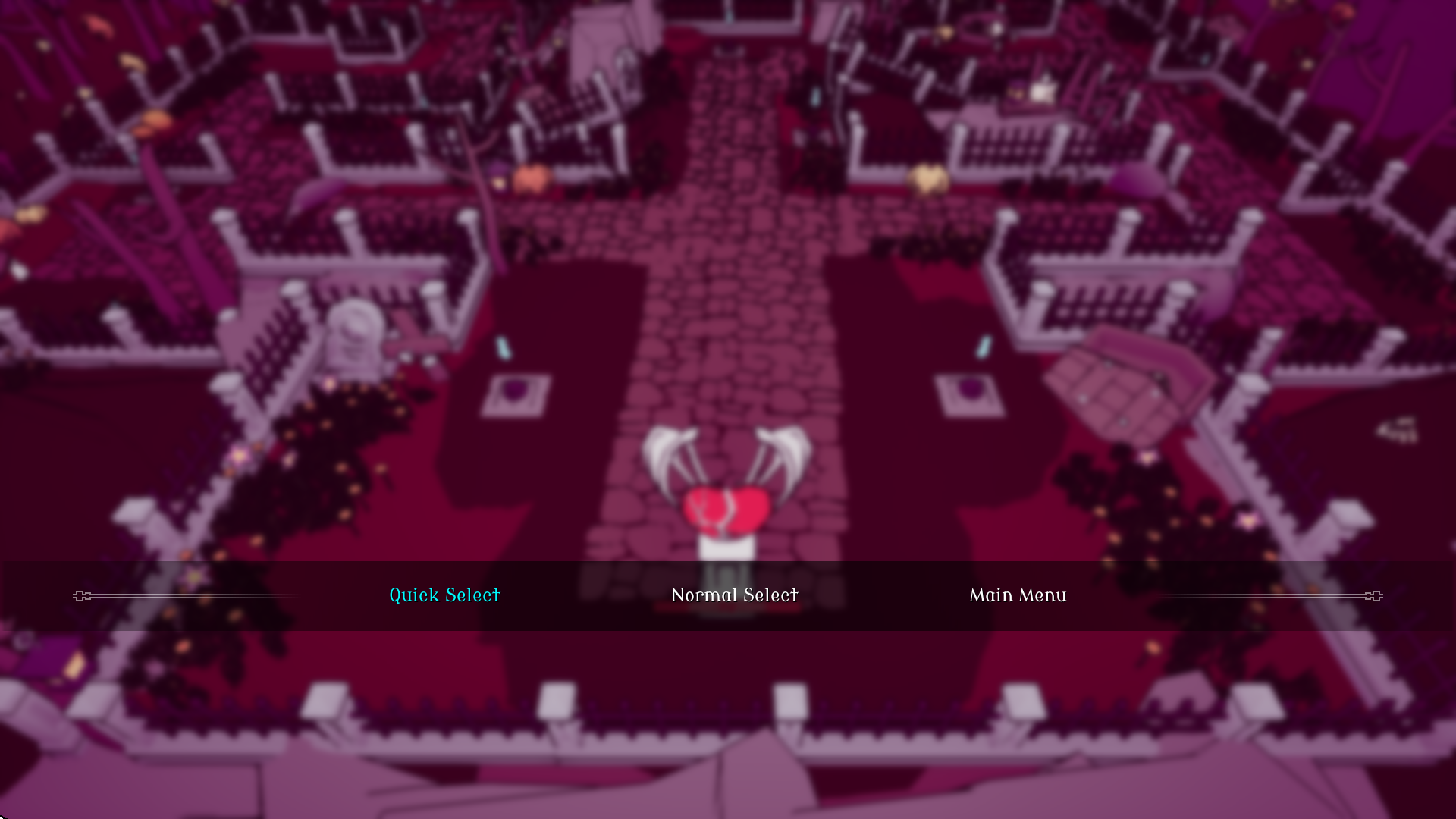
Design and implement all the game's UI
The overall user experience
Technical Design Responsibilities Included:
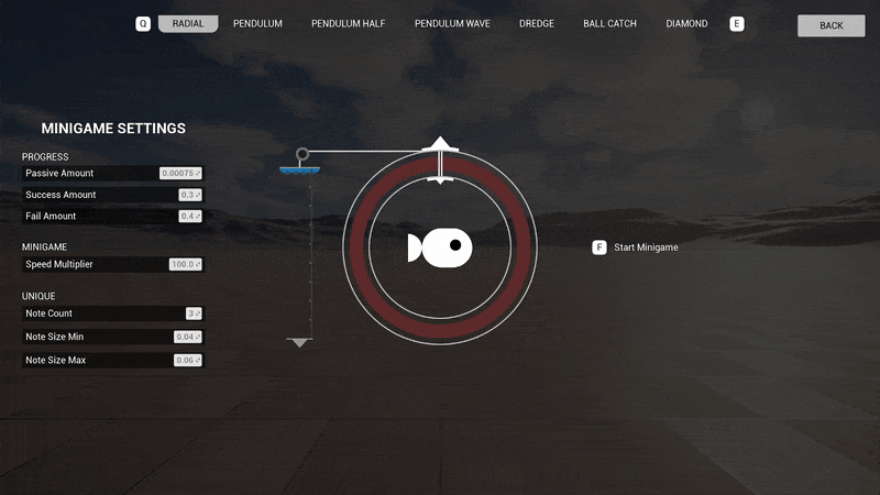
Design the game systems
Implement gameplay features; enemy spawning & structure building
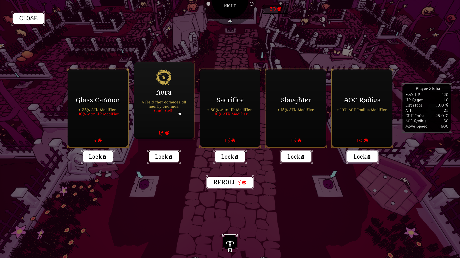
Decide on a structure for managing the game data, using data tables so it's easily accessible and editable
Making and editing most of the game data
READ MORE ABOUT THE DEVELOPMENT:
UI/UX Design Technical Design & Implementation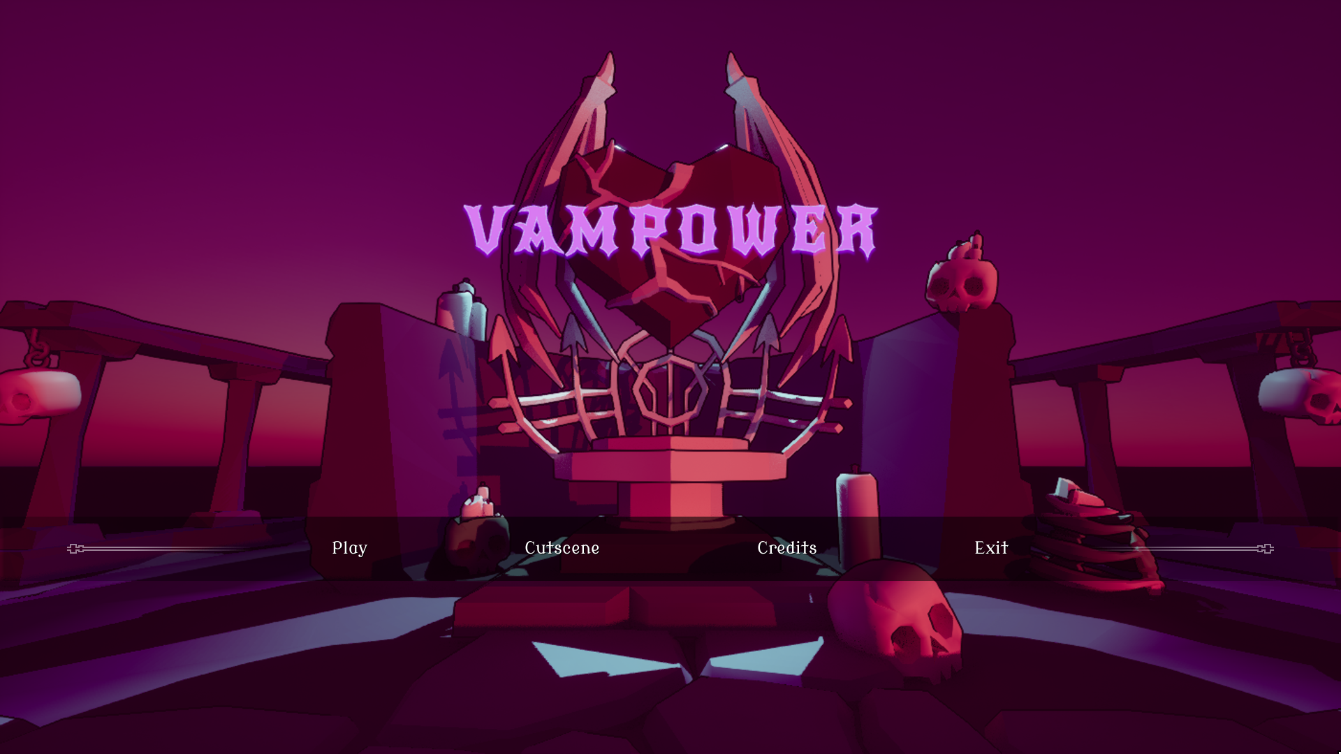
TAKE AWAYS
In short, we overscoped the game by a lot considering the limited timeframe.
UI/UX designer
-
New UI/UX workflow habits in Unreal Engine:
Utilizing the HUD-class.
Using richtextstyles for all the games text.
Reusing widgets instead of removing and constructing again.
How valuable doing research and getting references is.
Got to experience designing more complex gameplay menus. Struggles with how to best display a lot of information.
Technical designer
Communication and co-operation with programmers and other designers.
Problem solving, quick but effective solutions to get the game done in time.
Separating out data from functionality. Used data tables.
How to structure data in a readable and easily editable way.